Category: Main

  • That’s ruck craft, big boy

    That’s ruck craft, big boy

    I’ve always liked rucks.

    I’m a firm believer that one of the best things a team can do for its marketability is having a really tall guy who stands out in looks and play. My kids are currently Max Gawn supporters first and Melbourne supporters second. 

    As a Melbourne supporter approaching 40 I feel like I’ve seen my fair share of good rucks and then some. Of the 34 All Australian teams named since 1991, Melbourne has provided the first choice ruck eight times, plus another 3 inclusions on the interchange bench (Gawn 5+2, Jamar 0+1, White 1, Stynes 2).

    While we’ve had stats on hit outs and hit outs to advantage for a while, there’s a lack of understanding of how much these impact the game. Let’s look at the potential outcomes of a ruck contest and see where the most value for a team is.

    As you’d expect, getting a free from the ruck contest is by far the best outcome, followed by hit outs to advantage. Ruck hard ball gets also put you in a good position.

    If we look at hitouts overall though, even when including hit outs to advantage as part of that, they barely move the needle. A quarter of them don’t lead to a clearance at all, and teams are almost as likely to concede a clearance or scoring opportunity after winning a hitout as they are to generate one.

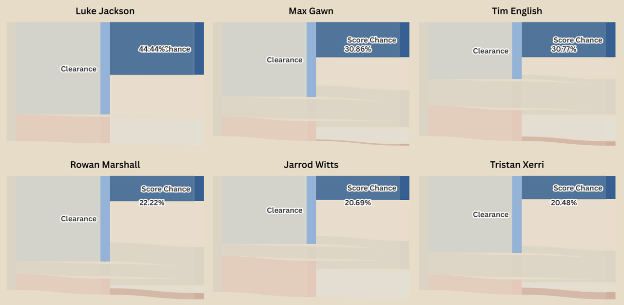
    Another consideration is that two Ruck Hard Ball Gets aren’t necessarily the same. Let’s break down some of these outcomes by the top 20 rucks (by hitouts recorded in 2025).

    (Selecting one of the flows will highlight that flow across all charts, allowing for easier comparison)

    In terms of getting the ball moving, Oscar McInerney and Brodie Grundy are kings – 85% and 80% of their RHBGs resulting in a clearance for their team. For the next step along, Luke Jackson generates a scoring chance from 44% of RHBGs, well ahead of the next best in Gawn and English, both sitting at 30%.

    43% of Kieran Briggs’ RHBGs end up with a clearance going the wrong way, while Sean Darcy is a rock – 25% of his result in the ball not clearing the stoppage area.

    Turning to Hitouts To Advantage, Jarrod Witts leads the league in seeing HTA turn to clearances with 83% ahead of Darcy Fort and Matt Flynn on 80%. 30% of Jordon Sweet’s HTAs result in a scoring chance, but he also has the highest number of HTAs turn into an opponent scoring chance at 9.2%. This highlights that these figures can be heavily influenced by the supporting midfielders. Port are electric when they’re on, but can lack some defensive accountability with the league’s worst opposition score from stoppages.

    Now that we know what they’re worth, let’s look at how good teams are at generating them. There are some limitations on the data I have – one being that I don’t know who the opposing two rucks are – only the ones that record a stat (Ruck hard ball get, hit out, getting or conceding a ruck free). Because of that we have to look at these stats team-wide rather than individually.

     Melbourne, North Melbourne, Sydney, and Carlton are the best at generating positive outcomes – each getting a Ruck Hard Ball Get or better from at least 18.4% of their ruck contests compared to an AFL average of 15.4%.

    Looking at the other end, West Coast, Essendon, St Kilda, and the Giants all give up good starting position relatively regularly. Looking at the differentials (% of contests gaining Ruck Hard Ball Get or better minus % of contests conceding the same), Melbourne and North Melbourne are clearly in front at +6%.

    Now, ruck frees aren’t that common, occurring about one in every 36 contests. However, they are impactful – as we discovered earlier 20% of them lead to a scoring chance – so they do warrant a further look.

    Since 2021 the best players at generating more ruck frees than they give away are Ben McEvoy and Sam Hayes. In the opposite direction, Stefan Martin is the only player to break the -1 free per hundred contests barrier.

    For a bit of fun let’s wind up with the head to head ruck free kick counts for the 15 rucks with the most hitouts since 2025.

    The thing that jumps out to me here is just how hard Jarrod Witts is to ruck against. A lot of ruck frees seem to come when an experienced ruckman is up against a pinch hitter. Witts is posting big numbers against the elite rucks of the competition with only Darcy Cameron (5-1) and Oscar McInerney (2-1) getting the better of him.Finally, numbers can only tell us so much. I highly recommend Jeff White’s youtube channel (https://www.youtube.com/@First_Use/videos). It contains a lot of video analysis, but with a particular focus on ruck contests and stoppage play.

  • The thin dotted line

    The thin dotted line

    This article was originally published on ThisWeekInFootball.com

    Player contracts have obviously been in the news a lot lately, particularly in the wake of Melbourne signing Kysaiah Pickett to the end of 2034.

    Using Footywire’s database of contract status I thought it would be interesting to look at how each list shapes up in terms of who is locked away and for how long.

    To the left, in the faded area, you can see how long a player has been on that club’s list. The right shows how far into the future they are contracted.

    Let’s also get a quick summary of who has the most potential fluidity in their list over the next few years.

    For this year, Port Adelaide and Collingwood have the highest proportion of their list unsigned.

    If we look forward to the end of 2026. Carlton, Port Adelaide again, as well as Hawthorn and West Coast all have 70% of more of their players yet to extend.

    At the three-year mark we’ve got Richmond, St Kilda, Carlton and Hawthorn with 90% of their list potentially out of contract by then, with the Bulldogs just shy.

    Going from the opposite direction Fremantle, GWS, Collingwood, and Brisbane have the highest proportion of players contracted out past the end of 2028.

    West Coast, Essendon, Gold Coast, Hawthorn, and Collingwood are the only clubs with no players contracted beyond 2030, with West Coast’s longest current commitments ending with Jake Waterman, Jack Hutchinson, and Liam Baker in 2029.

  • Goal kicking isn’t one of the most under-rated stats, but it’s maybe one of the most poorly analysed

    Goal kicking isn’t one of the most under-rated stats, but it’s maybe one of the most poorly analysed

    This article was originally published on ThisWeekInFootball.com

    This article makes heavy use of the excellent wheeloratings.com by Andrew Whelan for this piece (and many other pieces). If you’re not familiar you should go have a look, it surfaces a lot of things that will help you understand the game far better than official league stat offerings.

    Goal kicking, eh?

    Last week for the ABC Cody and Sean poured some much needed cold water on the supposed goal-kicking crisis. More articles followed this week and, apart from the aforementioned, surface level would be a generous description of them.

    Goal accuracy = goals / shots. It’s a simple proposition and attractive because of it. However, like many simple explanations it misses more than it hits.

    I’ve instead measured teams goalkicking performance based on three different attributes:

    • Volume – how many shots is a team generating per game

    • Quality – on average, how high quality are those shots (xScore per shot – xScore is a measure of how many points on average you would expect a given shot to result in by comparing it to similar shots taken previously. A set shot from the goal square would have an xScore of almost 6, a shot under physical pressure from the boundary might have an xScore of under 2.)

    • Execution – is a team making the most of those opportunities (total score / total xScore)

    It’s my tentative view that execution is largely chance based rather than a quality of a given team. Over the past 5 seasons the only team to not record seasons both in the negative and positive is Fremantle. Last year Melbourne were above average in executing while this year they’re abysmal. If you’re going to be weak in one thing you want it to be this because it doesn’t represent a structural problem.

    I’ve then grouped teams on overall performance in these categories:

    • Elite – overperforms in at least two of the categories

    • Poor – underperforms in at least two of the categories

    • Strength outlier – A mixed bag, but defined most clearly by a strength

    • Weakness outlier – A mixed bag, but defined most clearly by a weakness

    • Average – Teams who neither overperform or underperform majorly in any given category

    Some interesting things jump out right away.

    Geelong and the Dogs excel on all metrics. If you need another excuse to hop on their premiership chances, this will help you get there.

    By contrast Adelaide’s quality of shots is lagging a bit. Gone are the days of Tom Lynch or Josh Jenkins getting endless passes out the back to an undefended goalsquare. These “cheapies” have been made up for by volume of shots and maximizing the chances they do take.

    Collingwood’s attacking strength has been predominantly the volume of opportunities they create, with fairly average quality and execution.

    Gold Coast and North Melbourne are both generating their shots in really dangerous places. The difference between the finals fancy and the Roos at the bottom of the ladder is North’s lack of supply – which continues to be a critical problem.

    St Kilda and Hawthorn don’t have a real strength or weakness and hit around average on all three measures.

    GWS and Carlton’s execution has been strong through the year, making up significant ground in their attacking space. Fremantle’s quality of shots has covered a similar role for the Dockers.

    Brisbane are creating a lot of shots at a decent quality. But so far this year their execution has let them down. If their execution lifts they could easily click into another gear coming into finals.

    Melbourne are abysmal at executing on their shots, by far the biggest outlier of any metric by any team.

    Sydney’s quality of shots generated is the biggest thing letting them down. This may have to do with the lack of targets they’ve had up forward for much of the year.

    The bottom six has several predictable tales. Essendon are executing well enough on the shots they generate. Execution is Richmond’s strongpoint relatively but still below league average. West Coast is underperforming on all three metrics.

    We can also apply a similar method to looking at the shots a team concedes. For this one I’m not going to use a three-axis chart, as (in my view) a team has little control over the week-to-week accuracy of their opponent. What is replicable for a team’s defence is how many shots it concedes and where it concedes them.

    Collingwood are clearly the best defending team in the league – outperforming in both restricting the quality and volume of their opponents shots. Carlton are the clear next in line.

    Adelaide and Gold Coast are quite similar – doing quite well in restricting the volume, but around average for constraining those shots to low quality ones. GWS and Essendon are the reverse but moreso – elite for restricting their opponents to low quality shots, but they do allow a lot of them.

    The Dogs and Melbourne can restrict the volume of shots to some degree, but the ones they do concede are dangerous.

    Finals chasers Hawthorn, Fremantle and Brisbane are above average on both axes.

    While at the other end of the scale is West Coast. They are the Melbourne of this chart, a clear outlier that stretches the axis.

  • Clang a gong, we are on

    Clang a gong, we are on

    This piece was originally published on ThisWeekInFootball.com

    Last week I wrote about the three-year clangiversary of Hawthorn setting the record for most clangers in a match.

    I wanted to provide a bit of a broader overview of the clanger. We have data on clangers going back to 1998. Ted Hopkins, who co-founded Champion Data, is the one who popularised what has since become an integral part of the footy lexicon.

    I’d wager however that many of us (and even many broadcasters and journalists) don’t have more than a general sense of what a clanger is, so let’s bring out the virtual whiteboard.

    Now, how many clangers happen per game?

    If you look at just the numbers you’ll see a massive uptick in clangers since 1998. I don’t have a definitive answer on this, but I strongly suspect this is partly due to improvements in data capture and categorisation. Some of those actions above weren’t collected in the early days of Champion Data.

    We can see that since 1998 the average clangers per game has tripled. If we move to the second slide we can see that free kicks have stayed relatively stable, while other sources of clangers have grown significantly.

    From 2021 onwards we can see that the majority of clangers are disposals gone awry.

    We know what a clanger is, and we know how often they occur, but we haven’t addressed the key question – do they matter?

    Let’s look at the profiles of winning teams from 1998 onwards: 

    We find that over the last 5 years, a lower clanger rate (clangers / disposals) is a meaningfully better win predictor than a positive disposal differential.

    Having a lot of clangers doesn’t necessarily mean you’re performing poorly – some of the best players in the league frequently top the count. What matters is why you’re getting them – is it because you’re getting a lot of the ball, or is it because you’re being far less efficient with it than your opponent.

    Before we get to our top (bottom?) list, let’s take a quick look at the clanger profiles of each team.

    And finally, here’s the 20 worst clanger counts, clanger differentials, and clanger rate differentials.

  • Before hokball there was hackball – when the Hawks set the record for most clangers in a match

    Before hokball there was hackball – when the Hawks set the record for most clangers in a match

    3 years ago today (5/6/2022) Hawthorn achieved a mighty feat – posting a record 93 clangers in their round 12 clash against Collingwood.

    As it turns out this was a pretty costly time to do it, as they wound up losing by a mere points. Let’s revisit that messy match on its clangiversary.

    48 of Hawthorn’s 93 clangers were from disposals (32 kicks, 11 handballs, and 5 ground kicks), while another 26 came from free kicks conceded. I don’t have as reliable data on the remaining 19 which would be a mix of 50 metre penalties, unforced errors, debits (spoiling a teammate’s mark), and dropped marks.

    Let’s have a quick look at the raw numbers first

    Raw numbers don’t tell us the whole story. For both the disposal clangers and the frees against I’ve got a reasonable amount of info so lets plot them out.

    A couple of things stick out really badly here. The kick backwards into the centre square that ends up gathered by De Goey, the three handballs intercepted by Collingwood in their F50, and the hack ground kick that leads to an uncontested mark by Jack Crisp just outside the arc.

    As you’d expect, the free kicks given away in Hawthorn’s defensive half are more costly – with five of them resulting in a Collingwood score either in that chain or the subsequent one.

    For next week’s edition of This Week In Football I’ll look at putting something together on how this game stacks up compared to others (Collingwood tied the record the following year against Adelaide). Of the 25 highest clanger games, I’ve got this kind of data for 19 of them so we’ll be able to look at where and how they happen in a good bit of detail.

  • 15 years ago today – The miracle in mud?

    15 years ago today – The miracle in mud?

    15 years ago today, 29/05/2010 saw Damian Hardwick record his first win as senior coach.

    Richmond came into the match 0-9, anchored to the bottom of the ladder with an average losing margin of 9 goals. Port Adelaide were playing at home with a respectable 5-4 and currently sat in the top 8.

    Sometimes however the footy gods give you just what you need. In this case: rain.

    Five days earlier Adelaide saw 34 mm of rain, and there was another 13 mm on the day. Football park had a reputation for being waterlogged, being built on a swamp doesn’t help, and this was enough to bring the game down to a level Richmond could compete at.

    The game is most notable because it still holds the record for most tackles recorded across both teams – 248.

    Angus Graham, Shane Tuck (14), Andrew Collins (12), Shane Edwards (11), and Robbie Nahas (10) led Richmond’s count, while Dom Cassisi (12), Travis Boak, Kane Cornes, and Jay Nash (9) led the Power.

    It was a tight game at quarter time with Richmond taking a 3.4.22 to 2.4.16.

    It wouldn’t stay that way. Port scored just one more goal for the game through Daniel Stewart in time-on of the third quarter. Richmond scored relatively freely for the conditions to win by 47 points with Jack Riewoldt (4), Ben Nason (3) and Robbie Nahas (2) scoring multiples.

    Five of Richmond’s players on the day would eventually become premiership players – Astbury, Cotchin, Edwards, Martin, and Riewoldt. Four players of Port’s premiership side in 2004 were selected – Carr, Cassisi, and the Cornes Brothers, while a fifth was coaching their opposition.

    Both teams would record a further 5 wins for the season, although you’d assume Richmond were more satisfied with their return than Port.

  • Draft pick and mix

    Draft pick and mix

    This article originally appeared at This Week In Football.

    Draft picks are one of the primary resources available to an AFL club – maximising them can lead to dynasties, whiffing on them can leave a club in a very dark place.

    Our first chart looks at each top 10 pick from the last 10 drafts. It’s organised by how many years into their career a player has reached – so the first column has the first year output of every top 10 pick, while the last column has the outputs in years 8-10 for the 30 players selected in 2014, 15, and 16 (being the only ones in the system long enough to have had an 8th, 9th, or 10th year).

    We can see a couple of things immediately:

    • Of the 100 players drafted in the top 10 since 2015 all but 4 were still in the system by their 8th year. The exceptions being Fisher McAsey drafted by Kuwarna, Sam Petrevski-Seton and Lochie O’Brien by Carlton, and Jaidyn Stephenson by Collingwood.

    • They’re generally still at their original drafted clubs, the main exception being the older group of Suns and Giants like Callum Ah-Chee, Jack Bowes, Izak Rankine, Jack Scrimshaw, Jacob Hopper, Tim Taranto, and Will Setterfield.

    • There’s a fair bit of variance in how many games first year top 10 picks get, but most clubs range around the 50-75% of possible games played.

    • As you’d expect, a small proportion of those games are rated elite. The impact of Connor Rozee and Nick Daicos here is amplified by Collingwood and Yartapuulti only having taken 1 other top 10 pick between them in the last decade (although the other, Jaidyn Stephenson, had three elite rated first-year games – as many as Nick and one more than Connor)

    • As they move forward in their career the proportion of games played and proportion of elite games played lifts – both as players settle into their career, and at the risk of putting things too harshly the average stops getting dragged down by players who weren’t making it and have left the club.

    • Gold Coast has taken 16 top 10 picks in the last decade – literally breaking the axis of my chart.

    • North are the only team to have lost a top 10 selected player after only 1 year – Jason Horne-Francis. If we look to players leaving after two years we also pick up Josh Schache from Brisbane, Jack Scrimshaw from Gold Coast, and Will Setterfield from the Giants.

    • Josh Gibcus’ injury struggles are clearly visible on Richmond’s chart.

    Now the top 10 isn’t the whole of the draft so here’s something for the real sickos. I have attempted to chart every club’s entire draft haul over the last decade, from the top of the national draft through to mid-season drafts, supplementary picks, even the Essendon top-ups.

    There are a couple of bugs I know about but haven’t had the time to iron out yet – Marty Hore (Narrm), Matt Carroll (Carlton), and Derek Eggmolesse-Smith (Richmond) hold the distinction of being drafted by the same club twice. In Marty Hore’s case it wasn’t even a case of shuffling the rookie list as he spent time delisted inbetweeen. They each appear twice on their team charts.

    The other requires an apology to Sam Fisher, not the Euro-Yroke player, but the one who spent one year on Sydney’s list in 2017. For whatever reason he kept breaking Sydney’s chart every time I tried to render it so I’ve expunged him from the records. Sorry Sam.

    Beyond that, have a look – it’s broken down into categories of draft picks and shows games played at the club or subsequent clubs, as well as highlighting elite rated games.

    If you want to engage with me or tell me I’ve got something horrendously wrong, the best place to do so is over on BlueSky.

  • Marking Out

    Marking Out

    This post originally appeared on This Week In Football.

    Just a snapshot from me this week, but one I intend to build on as the season goes.

    Reading through James’ analysis of Melbourne’s forward entries last week put F50 marking opportunities even more front of mind for me than it has been for the last few years.

    To paraphrase Scott Steiner (and more recently his nephew Bronn Breaker), they say all marks are created equal, but you look at Melbourne, and you look at Gold Coast, and you can see that statement is not true.

    A noticeable element of Melbourne’s forward line for a long time has been when they do generate marks inside 50, it often seems to be from lateral leads deep into the pockets generating low quality shots.

    A quick look at WheeloRatings.com seems to back this casual observation up – they have been bottom 2 for the average xScore from set shots every year back to 2021.

    To enable some quick analysis we’re going to define a “hot zone” – within 40m of goal and at no greater than a 30 degree angle from either goal post. Any time you draw a line it will cause some arbitrary inclusions and exclusions, but to me this seems like a pretty solid feel of what a really high quality opportunity looks like.

    I’ll also break down the marks in those zones into three categories – Contested, Marks On Lead, and Uncontested.

    Here’s how teams in 2025 are performing generating marks in the zone.

    Unsurprisingly, Melbourne are dead last for marks in the most valuable area, and with a particularly bad return from contested marks. This is despite them generating the most offensive 1 on 1 contests in the league (16.3 per match, Carlton being the next on 13.2) and tracking at just below league average win rate for those contests.

    It’s also worth looking at how teams are conceding marks in the zone.

    West Coast and Melbourne being bottom 4 on both tables really illustrates some of the problems they’re having. West Coast are off the charts on conceding high value uncontested marks, which probably speaks to the kind of entries their midfielders and forwards are allowing opponents to set up through lack of pressure. I was somewhat surprised to see North with a relatively modest return here – not good by any stretch, but not catastrophic. 

    To finish up we’ll combine the two tables for a net differential which again shows Melbourne and West Coast as two laggards. The numbers don’t lie, and so far they’ve spelt disaster for both teams. 

  • Showdowns and letdowns

    Showdowns and letdowns

    Sometimes it’s fun to just light some fires. What better way to do that than to attempt to rank the marquee games in the AFL fixture (and before that, annoy people just by deciding which games get included in the rankings to begin with).

    My list of marquee games is as follows:

    • Round One – Carlton v Richmond

    • Easter Thursday – Brisbane v Collingwood

    • Good Friday – North vs Miscellaneous

    • Easter Monday – Geelong v Hawthorn

    • ANZAC Eve – Melbourne v Richmond

    • ANZAC Day – Collingwood v Essendon

    • King’s Birthday – Collingwood v Melbourne

    • Dreamtime At The ‘G – Essendon v Richmond

    • The Derby – Fremantle vs West Coast

    • The Q Clash – Brisbane v Gold Coast

    • The Showdown – Adelaide v Port Adelaide

    • The Sydney Derby – GWS v Sydney

    I’m going to be rating them across several criteria based on the most recent 10 occurrences:

    • 50% Competitiveness

      • Evenness of win-loss record

      • Mean margin (absolute, not team-specific)

      • Proportion of games decided by under two goals

    • 25% Player engagement

      • MRO sanctions resulting from matches

      • Frees Against

    • 25% Fan engagement

      • Attendance (Both raw and as a proportion of capacity)

      • Perceived rivalry/dislike

    So, let’s get into it

    Competitiveness (50% of total)

    Win-Loss Record (15% of total)

    A pretty simple one here, we want to look at the team with the winning win-loss record and see how far above 50% that record is.

    So let’s start off with that, proportion of games won by the series winner, and subtract 50%. A 50-50 win-loss split will yield 0, a 10-0 sweep will yield 0.5

    Let’s multiply those results by 30, and then subtract the result from 15.

    That will mean a perfectly even split will get the full 15 points on offer, while a sweep will get zero.

    Mean margin (15% of total)

    The highest mean margin we’ve got is just under 60 points, so we’ll set our baseline there. I think it’s reasonable that if the average match in the slot is a 10 goal blowout you don’t get any points here.

    Based on that we take a quarter of the average margin and subtract that from 15 to get our points. Here we are looking at the margin regardless of who won – a match where one team is 10-0 but the average margin is 20 points will still score relatively well in this category.

    Proportion of close games (20% of total)

    This does result in a little bit of double-counting with the previous measure, but I think the concept of a two goal margin being a close game is well enough established that it warrants consideration.

    Take the percentage of games decided by 2 goals or less and double it to get our points.

    Player engagement (25% of total)

    MRO sanctions (12.5% of total)

    Look, I don’t want to glorify violence. Personally I think the league should take a much tougher stance on things like intentional strikes, regardless of impact. That being said, I think the sanctions handed out during a game can provide some degree of insight into the dislike two teams feel for each other.

    For this, I’ve gone back through to the start of 2023 looking at each MRO report. Prior to that I didn’t have any confidence that I was able to surface every match, so I’ve drawn the line there.

    Where a suspension has been recommended by the MRO I’ve graded it a number of points based equal to the weeks suspended. Where a financial sanction has been recommended I’ve awarded that as half a point. I’ve also excluded umpire contact from the sanctions in this criteria as I don’t feel they get to what we’re after.

    Taking the average points over the matches in the sample period gave a maximum of just under 3, so we multiply the result by 5 to get our points here.

    Frees Against (12.5% of total)

    Sanction by the MRO is a pretty high bar to clear, so I also wanted to look at a marker for lower-level ill-will and bad blood.

    To do that I looked at the total frees against by each team, and compared that to that team’s average for that season. For 9 of the 12 games there was an increase, and the range of change went from -12% to +24%.

    We’ll add 25% to it (producing a figure of up to 50%) and then halve it to give us our 12.5 points.

    Fan engagement (25% of total)

    Attendance (12.5% of total)

    Crowd absolutely has to come into this, and honestly I may be undervaluing it in the ratings a fair bit. I want to recognise both the sheer number of people, and the degree to which a stadium is packed out.

    I’ve taken the average crowd over the last 10 matches (excluding games impacted by COVID) as well as the average proportion of stadium capacity filled. I don’t want this to just be whichever match happens to happen at the MCG being on top, so I’ve weighted the proportion of capacity more heavily than the raw crowd figures.

    I’ve taken the average crowd divided by 10,000 and then multiplied that by 1.25 – giving a maximum of 12.5 for an average 100,000 crowd.

    I’ve then taken the average percentage of capacity filled and divided it by 10 (giving a number from 0-10) and multiplied that by 3.75 (a number from 0-37.5). That gives us a total of 50 points, which we’ll divide by 4 to fit into our 12.5.

    Perceived rivalry

    The guys over at The Back Pocket have very kindly given me a sneak peek at their 2025 fan rivalry survey. The survey asks which team you support, and which three teams you dislike (not in a specific order).

    I’ve used that to create a list of the three most disliked teams for each supporter base and given 3, 2, 1, or 0 points depending on position. Add that to the reverse and we’ve got a rating from 0-6 which we’ll then scale up to between 0 and 12.5.

    Combining those elements gives us the following ratings out of 100, and our final rankings.

    Overall I’m pretty happy with these rankings – it matches up fairly closely to my interest level in watching the various fixtures from a neutral perspective.

    To further visualize where each match-up is assessed as stronger, this radar chart converts each component to a rating out of 100.

    There you go, an objective and scientific approach to ranking the marquee games. Feel free to come yell at me on bluesky about how you disagree.

  • Creating credible threat

    Creating credible threat

    This week I want to talk about how to dissect a bubble (carefully I guess).

    Last week on This Week In Footy Jasper Chellappah talked about bubbles when examining Carlton, after Adam Simpson brought it up on his segment on AFL 360.

    In the modern game teams generally defend space more than they defend players. Cody Atkinson and Sean Lawson wrote about this for the ABC back in 2020. In the broadest and simplest terms, a defence will be relatively happy if they can make close options risky, and long options easy to neutralise – the attacking team want to do the opposite.

    To maximise their chances, the attacking team needs to pose as many credible threats as possible. Even if you don’t use them on a given play, the more places a team feels like it needs to defend, the weaker its defence will be in any one spot.

    Consider a simplified example below. The attacking team in blue is seeking to advance the ball from a half-back flank.

    The first team is known for not utilising switches or short sharp passes. Three defenders are able to guard the 30-55m range with a lot of overlap. There aren’t any kicks in the attacking team’s comfort zones that are good options and they likely end up kicking it long and hoping for a stoppage or a contested mark.

    The second team has good foot skills, they utilise short kicks and are capable of switching effectively too. Defenders need to move forward to be able to guard the 20-30 metre kicks which then creates opportunities for long kicks. They need to actively guard against a switch creating more space again. That space will be filled by defenders further up-field, but we are still stretching them thinner across the whole field, and putting them out of position if the ball does get through.

    In fact, it’s actually compounded when you look at the second line of defenders. Not only do they need to move up to cover some of the first disposal possibiltiies.

    I’ve been wrestling for a  couple of weeks now for how to look at how a team creates credible areas of threat (short of having access to GPS data or behind the goals footage and another 40 hours in my week).

    What I do have is where the ball has gone. It seems pretty logical that a threat is only really credible if it gets used sometimes, so if we look at where the ball has tended to go, we can see whether a defending team can limit the space they’re guarding, or have to stretch themselves.

    As a starting point I’m looking at just intercept possessions at what I’m calling true half-back – 40-60 metres from defensive goal, within the width of the centre square.

    My first instinct was to go with heatmaps of where the ball tends to have gotten to within the first X seconds after the intercept possession. You can see an example below, and I may return to that, but I really wanted something that could help me categorise rather than just visualise. Each ring represents 25 metres from the point of intercept, and up is towards attacking goal.

    My second attempt, and what I’m still iterating on, takes inspiration from Richard Little’s game style previews which included a graphic on direction exiting stoppage.

    Like in the above gif, up represents towards goal, and each ring represents 25 metres from the point of intercept. There’s a couple more things to unpack though.

    The diagram is divided up into sectors – Forward (within 30 degrees either side of straight ahead); Left and Right 45 (30-60 degrees), Left and Right Lateral (60-120 degrees), and Backwards (greater than 120 degrees).

    Each of those sectors is depicted through two things – colour saturation, and radius. The colour saturation represents the proportion of intercept chains that were within that sector X seconds after the intercept. The radius of the wedge represents the distance from the point of intercept they reached (radius is drawn at the 80th percentile of distance for chains in that sector, or put another way 4 out of 5 times the ball is within the shaded distance). Given these represent a point in time after the intercept, it’s probably more helpful to think about the radius as representing speed rather than just distance.

    So we can see in the above that generally 6 seconds after an intercept the ball is most frequently in the front sector for all types of chains. For scoring chains we can see a relatively even spread across 45 and lateral zones and it’s less frequent for the ball to still be behind the point of intercept. The most obvious thing however is speed of movement. For chains ending in stoppage, 4 in 5 of the frontal chains have been contained to within less than 25 metres of the point of intercept. For scoring chains this is doubled to 50 metres.

    Let’s now look at the whole league.

    A couple of quick things to consider:

    • Wedges are drawn at the 80th percentile of distance from the point of intercept in that sector – that is, for 4 in every 5 intercept chains the ball will be within the drawn areas 6 seconds after the point of intercept. Wedges are shaded darker based on the proportion of chains that are within that sector.

    • For every team other than Essendon (and St Kilda very marginally), the front sector is the most used

    • For every team other than Essendon, the front sector is the most used for their opponents.

    • Carlton and the Giants’ opponents aren’t going forward quickly – 80% of chains in the forward sector have travelled around 12 metres or less – contrast to Essendon, Richmond, and Sydney where that’s around the 50 metre mark.

    • St Kilda have one of the most balanced threat profiles, pretty well spread across front, lateral, and right 45s. They are also still in the back sector, but with the distance involved it looks like this is probably more from being behind the mark rather than actively moving the ball backwards.

    • Richmond favour long,lateral movement to the right.


    There’s a few important provisos here to keep in mind:

    • This is very much a work in progress, and it’s something I’ll likely keep iterating on through the season

    • The chart presented here doesn’t differentiate between intercept marks and non-marks

    • This is primarily about style, not effectiveness. I haven’t represented retention rates at all here.

    • We are still early in the season so sample sizes are low – things will be impacted by single game anomalies and which opponents a team has faced.

    As always, this is very much a work-in-progress. If you have feedback the best place to yell at me is over at bluesky – http://bsky.credittodubois.com